
Wine Wix
Brand Identity and packaging for a sustainable candle company
Wine Wix is a candle company, founded on a simple but meaningful idea: repurposing beautiful wine bottles into thoughtfully crafted candles. What began as a creative outlet quickly evolved into a small business built around sustainability, craftsmanship and everyday ritual.
Lake Media Collective partnered with Wine Wix to develop a brand identity and packaging system that reflected the heart of the product—hand-poured candles made from salvaged materials—while giving the brand a modern, scalable presence across scents, collections and sales channels.
Brand Identity
Logo Design
Color System
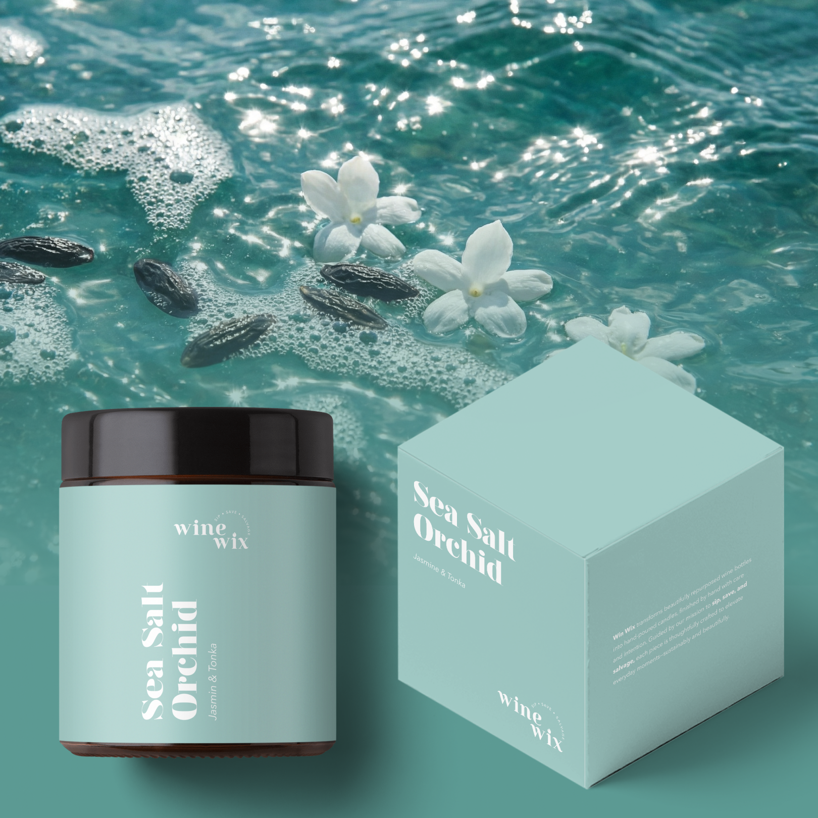
Product Packaging
Label Design
A Brand Rooted in Reuse and Ritual
Wine Wix’s mission—sip, save and salvage—became the foundation for the brand system.
The identity needed to feel clean and contemporary, while still honoring the handmade, sustainable nature of the product. The result is a brand that feels intentional but approachable, elevated without losing its warmth or authenticity.

A Flexible Identity Built for Scent
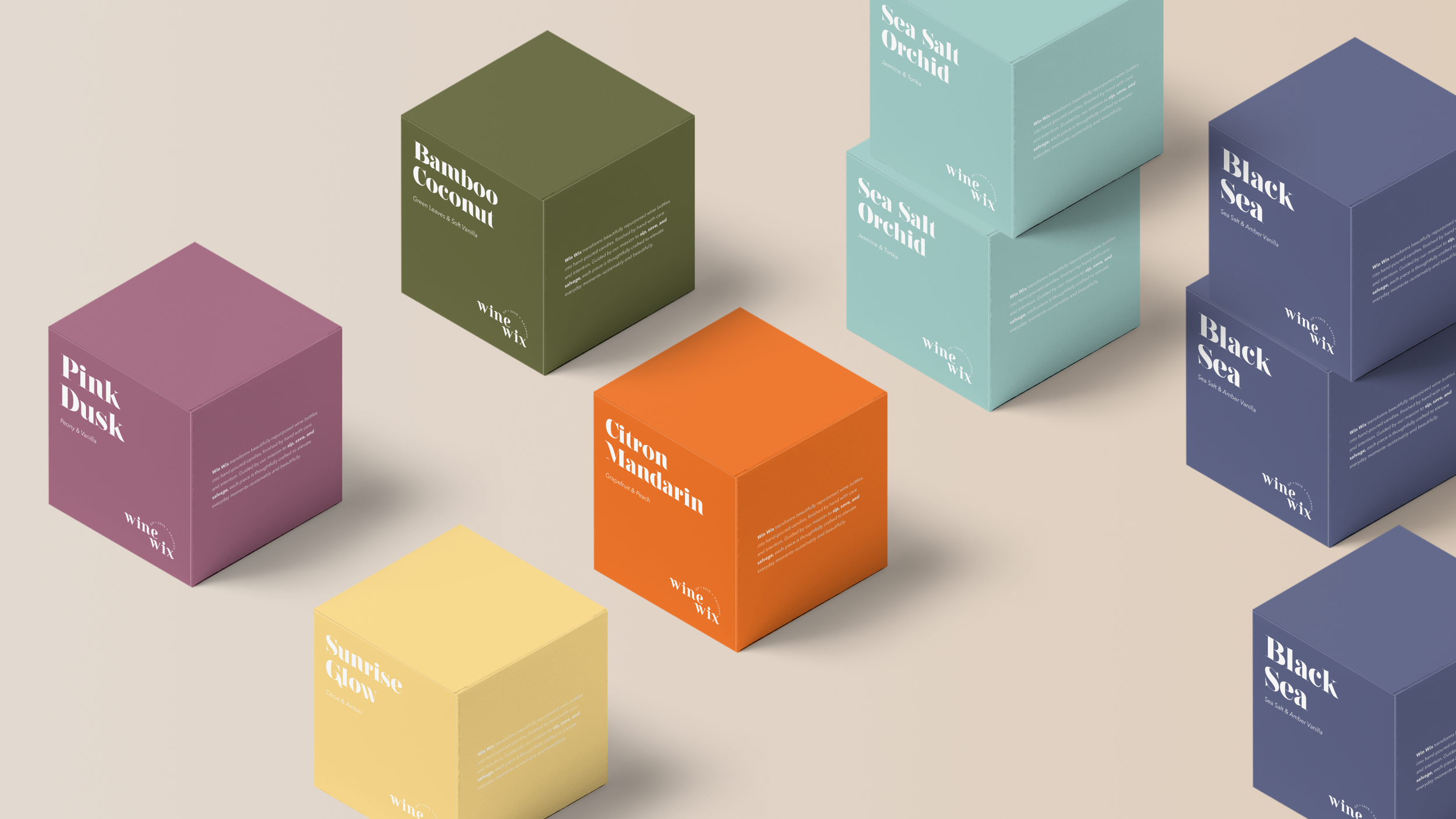
Because scent is the primary differentiator within the Wine Wix product line, the visual system was intentionally designed to adapt without losing cohesion.
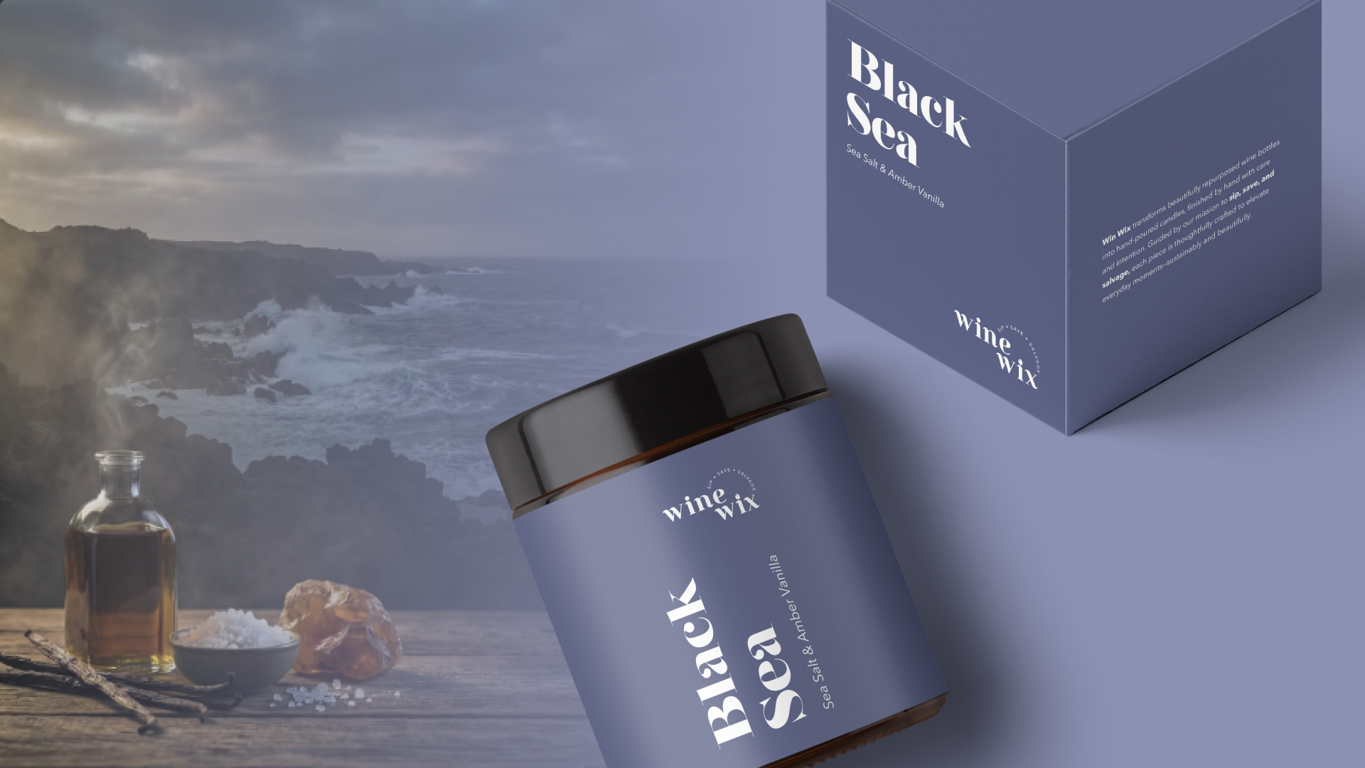
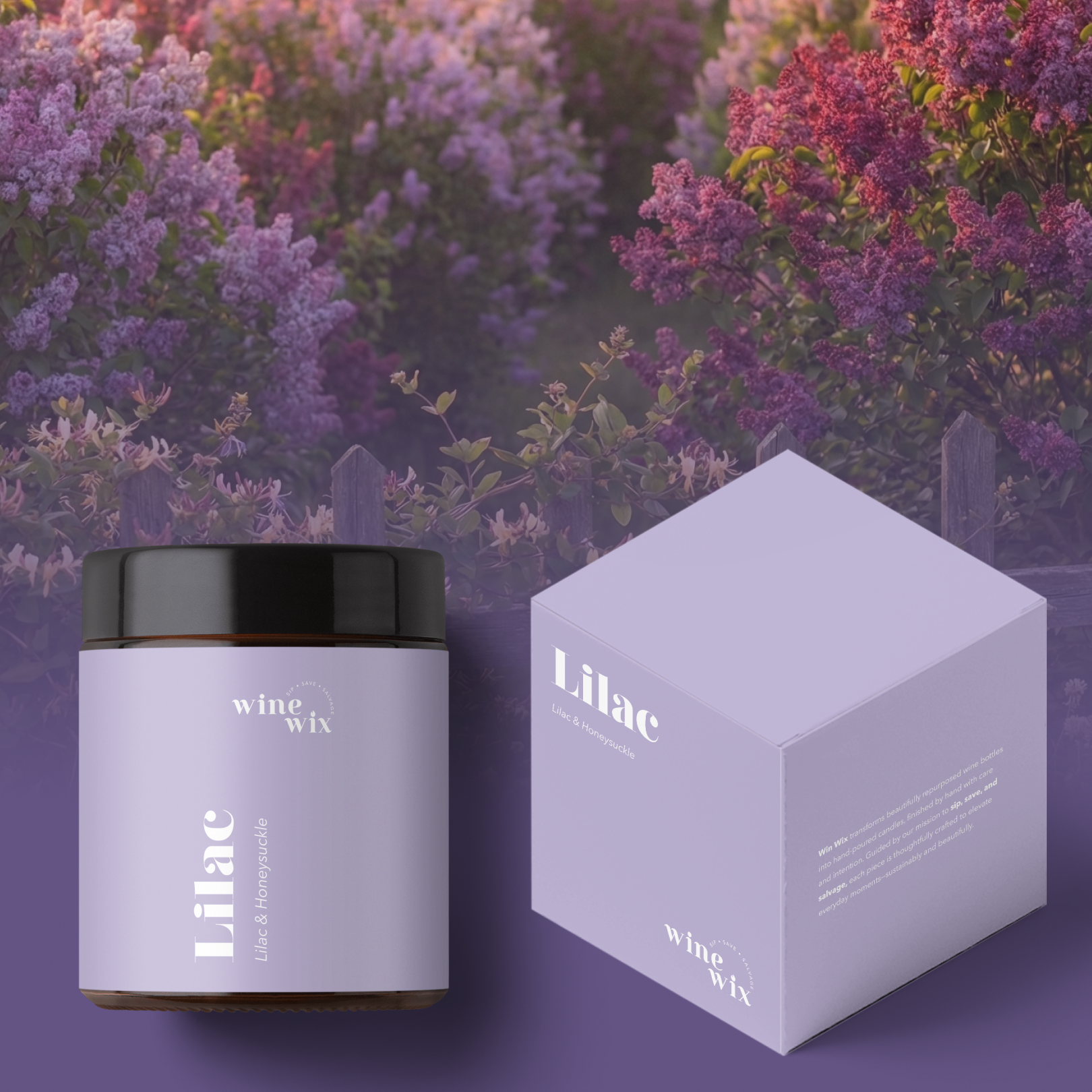
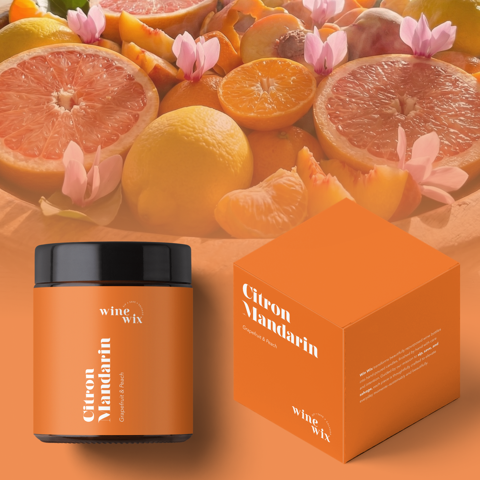
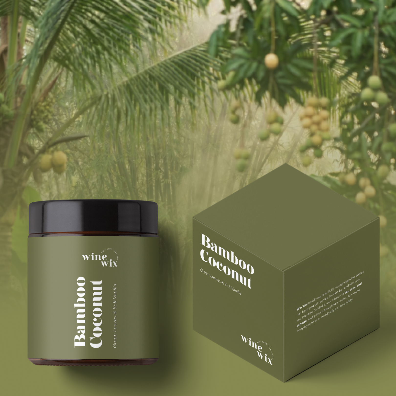
The logo is deployed exclusively in solid black or solid white—chosen based on background color—to maintain clarity, contrast, and brand consistency across every application. Surrounding it, a rotating color palette spanning the full color wheel serves as the defining expression for each scent. These colors are applied as bold, solid backgrounds across labels, packaging and supporting materials.
This approach creates a disciplined, scalable system: one that allows each fragrance to feel distinct while preserving a strong, recognizable brand presence. New scents and seasonal collections can be introduced effortlessly, without diluting the identity—giving customers and immediate, intuitive visual cue and reinforcing Wine Wix’s thoughtful, design-led approach.
A Logo That Reflects the Product
The Wine Wix Logo is clean, modern and subtly referential.
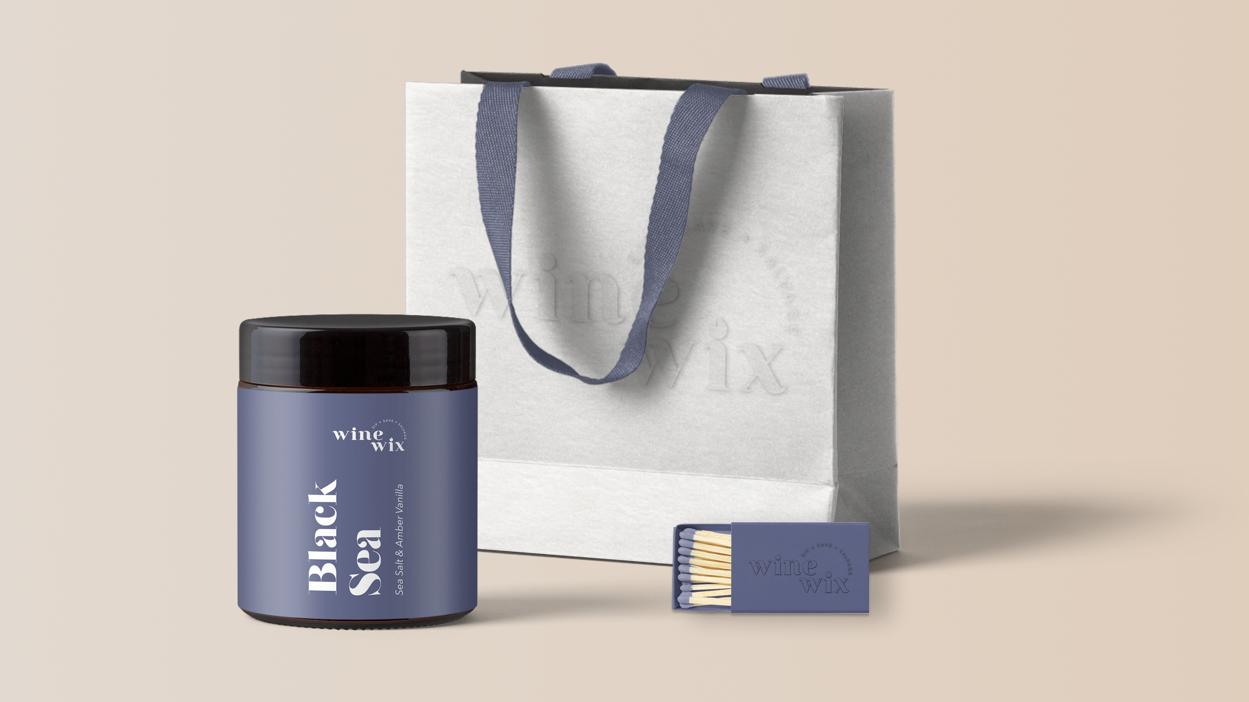
A flame integrated into the dot of the ‘i’ connects the identity directly to the product itself—simple, intentional and instantly recognizable. The mark works seamlessly across packaging, labels and digital applications, maintaining clarity at small sizes while standing out on shelf.

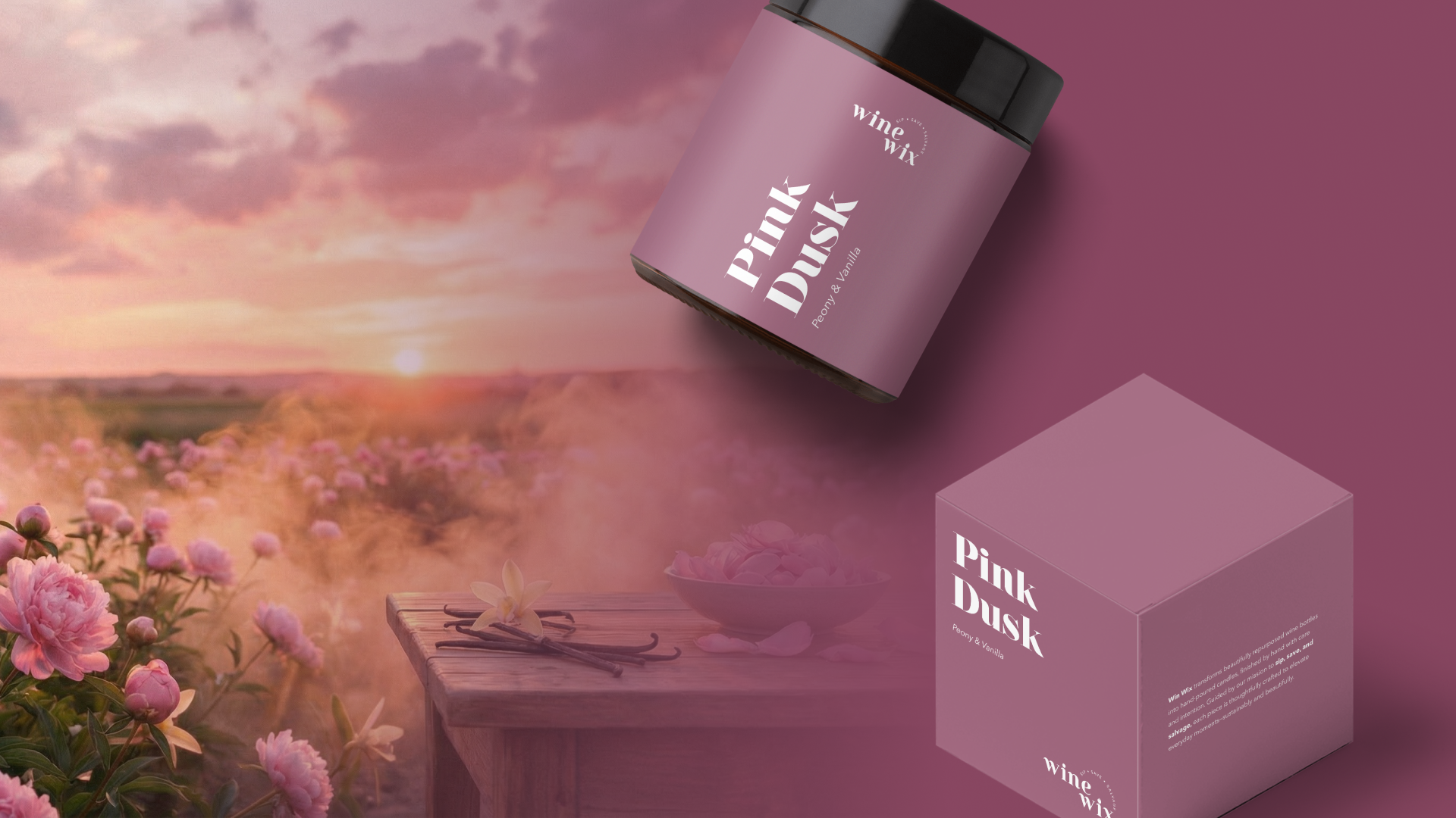
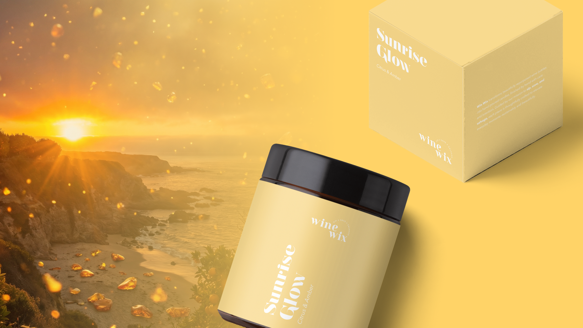
Packaging Designed to Let the Product Shine
The packaging system was intentionally restrained, allowing the repurposed wine bottles to remain the hero. Labels are designs to complement the glass forms rather than compete with them, balancing strong color with minimal typography. This ensures consistency across varying bottle shapes while reinforcing the handmade, small-batch nature of each candle.
A System Designed to Grow
From the outset, the identity was built to scale—supporting seasonal scents, limited releases and future expansions.
By grounded the brand in a flexible color system and a strong core mark, Wine Wix gained a visual foundation that can grow alongside the business while staying true to its original mission.
A Brand That Feels Thoughtful, Not Trendy
The result is a brand identity that feels timeless, adaptable and aligned with the values behind the product.
Wine Wix now shows up with clarity and confidence—celebrating sustainability, craftsmanship and the simple pleasure of giving new life to something once discarded.